How can I use IP3 ASSESS to help with prioritization of community needs?
IP3 ASSESS was originally designed in partnership with Kaiser Permanente to support the Community Health Needs Assessment (CHNA) process, including support for the prioritization of needs in a given community, and the platform is now also being used to support broader assessment needs among statewide and local community coalitions and health departments around the Nation.
There are three main features of the platform that assist with prioritization: (1) Use of data frameworks, (2) Z-score analysis, and (3) Integration of qualitative data and stakeholder engagement through IP3 | Assess Reports.
IP3 ASSESS automatically applies data frameworks to help analyze and present indicators organized in an actionable way. Data frameworks are simply a series of “domains” (you can also think of these as categories), and data indicators that populate those domains. Frameworks provide a powerful tool when using data to inform planning efforts to improve community conditions—they translate data into a solution by sorting indicators into categories that are more easily connected to real-life programming (e.g., Transportation) and thus more easily tied to action.
When examining data to inform an implementation plan, long lists of indicators aren’t as helpful because they fail to shed light on levers you can pull to improve your community. IP3 | Assess computes scores for both individual indicators and composite scores for each domain in a framework, allowing users to compare data not traditionally comparable and more easily go from community insight to concerted action. For example, you may know that your community has an above-average commute time, with a disproportionate effect on low-income residents, and that your community’s rate of unemployment is also higher than average, but what exactly does that mean for your implementation plan?
IP3 ASSESS enables users to compare their community’s relative score for transportation to its relative score for meaningful work and wealth to guide decision-making around which of the two areas to invest in.
Next, users can drill down to explore indicators in each domain to identify what, specifically, to focus on and how to prioritize efforts. Users can also toggle between different geographies to see how scores vary across service areas and explore differences in driving factors for good and bad composite (domain) scores. (Read our blog post about data frameworks to learn more.)
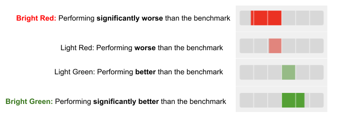
IP3 ASSESS uses a z-score approach to scoring individual indicators and data across domains in frameworks—the “fuel gauge” visualizations used throughout the platform depict z-scores relative to the selected benchmark (usually either the corresponding state or national value). In this way, users can see how a given community or geographic area performs relative to the state or Nation. This approach allows an "apples to apples" comparison of data from a variety of sources and with a variety of units and collection methods. (This approach aligns with the County Health Rankings methodology.)
The “fuel gauge” data visualization shows up bright red if an indicator or domain scores significantly worse than the benchmark, light red or light green if the data are not significantly different (within 1 standard deviation) from the benchmark, and bright green if the data are significantly better than the benchmark. (See below for an example, and read more about interpreting the fuel gauge visualization here.) The data are portrayed in red and green to quickly provide users with a clear idea of how an area performs for a specific data indicator, or across a domain, compared to a benchmark—simplifying the interpretation of data across the platform.
Prioritization is built into the data output on the Frameworks screen because red domains and indicators—those performing worse than the state or national benchmark—should be prioritized for improvement efforts above green domains and indicators.
Importantly, we acknowledge that quantitative data do not tell the whole story of what is happening in a community or service area. IP3 | Assess Reports provide an opportunity to highlight specific indicators or issues important to a community, and to integrate and display qualitative data alongside quantitative data in the platform. Qualitative data collected through key informant interviews and/or community conversations, alongside stories from people with lived experience in a community, support the prioritization process by painting a fuller picture of what life is really like in a given community and prompting decision-makers to consider more than just the quantitative data. (See a sample of IP3 ASSESS Reports here.)